Good Haus Cafe
Industry
Food and beverage services
What was produced
Visual Identity, Verbal Identity, Brand Strategy, Research
Apps used
ChatGPT with Custom GPTs, Perplexity, Midjourney, Weavy, Adobe Creative Suite, Human-led
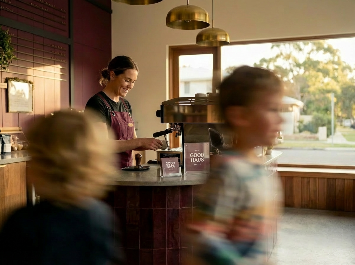
Good Haus is a café designed around real family life — creating space for parents to slow down, have a conversation, and feel like themselves again. It offers a calm, considered environment where good coffee is reliable, time feels unhurried, and the small rhythms of everyday life can unfold naturally. Children are welcomed as part of the space — present, but not the centre of it. But spaces like this are surprisingly rare.
Good Haus is a conceptual hospitality brand developed as part of the House of Gai AI Masterclass. The project explores AI-assisted brand strategy, creative direction and visual identity.
The problem
Many cafés create a difficult trade-off for parents. Spaces designed for adults often feel uncomfortable once children are present, while venues that actively welcome children tend to shift toward play-centre environments — loud, overstimulating, and not particularly enjoyable for adults.
At the same time, the local café landscape is largely undifferentiated. Most competitors rely on familiar language and broad promises — “good coffee”, “friendly service”, “community feel” — without offering a clear or ownable point of view.
For parents, this results in a gap: very few places exist where they can sit, talk, and exist as adults, while their children are naturally part of the environment.
-
Weavy:
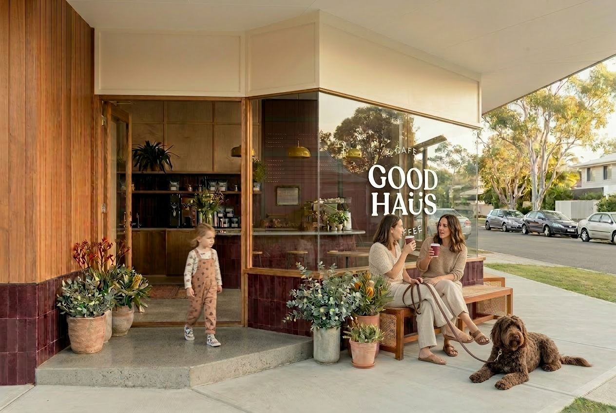
Turn this (reference image) interior reference image into a cafe shop front with wide timber-framed window, glass door framed by timber, design-led suburban Australian cafe. Polished concrete threshold, outdoor bench seating, native plants in pots, calm minimal design, Melbourne cafe aesthetic, soft muted tones of clay, eucalyptus green, warm beige and pale concrete, bright Queensland daylight, quiet suburban street with parked cars and wide footpath, architectural photography, editorial cafe design, photorealistic
Make the three windows into one large glass window, remove signage. Wood panels above door and windows to be painted cream.
Change the green tile colour to be maroon/wine colour tiles. In the same texture.
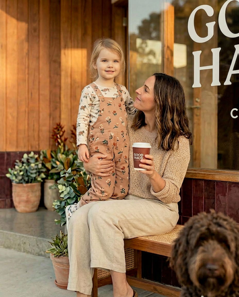
Two 35 year old women sit on the bench seat out the front of the cafe sipping on a plain maroon take-away coffee cups talking to each other. A 4 year old kid scooting past them with slight motion blur. Another 4 year old kid walking out the door.
Add a brown groodle dog on a leash laying down next to the women on the right.
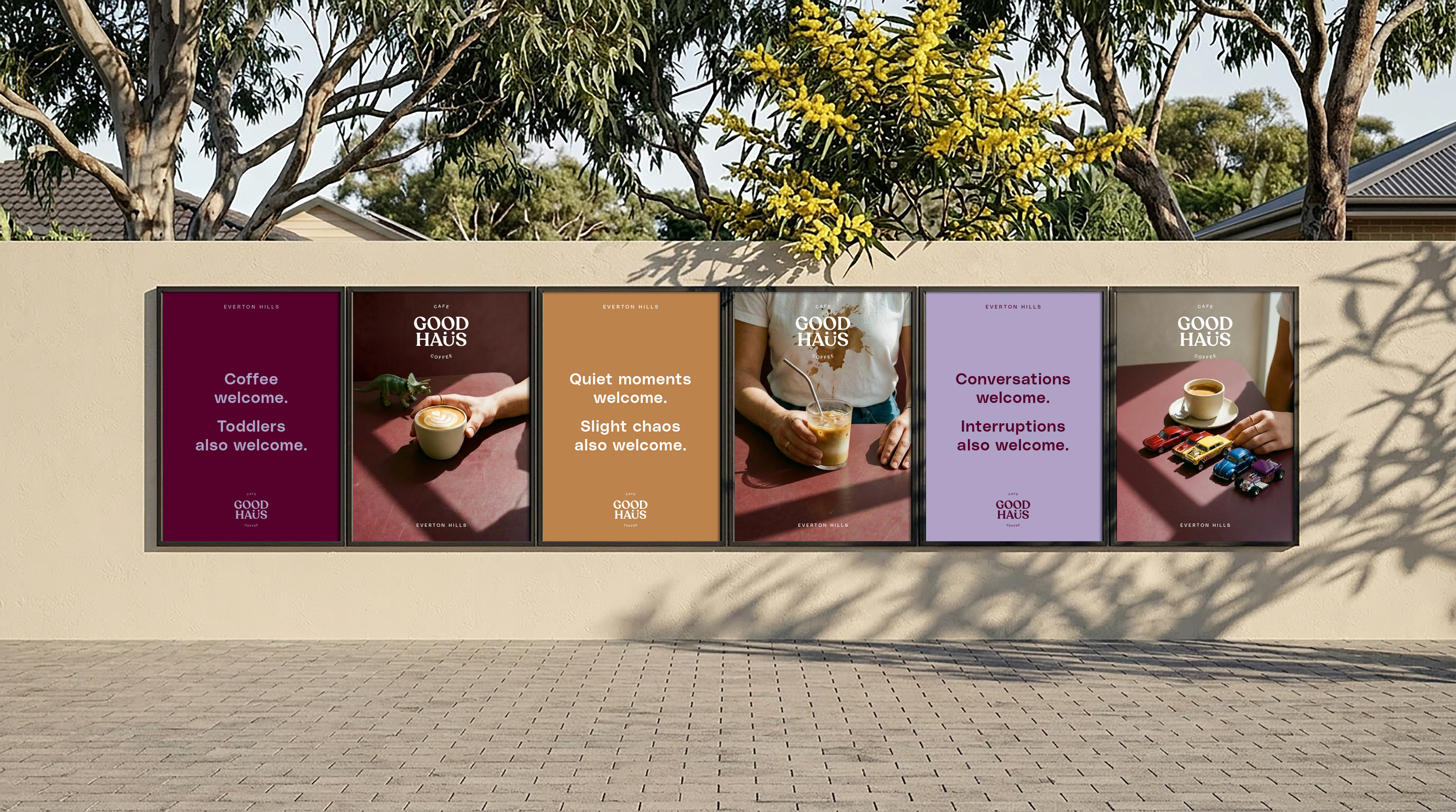
The Strategy
Finish your coffee.
Finish your sentence.
The strategy centres on the parent experience — creating a café that feels calm, grown-up, and easy to stay in, while naturally accommodating children.
Rather than separating adult and family environments, Good Haus holds both at the same table. The focus was on reducing friction, encouraging conversation, and designing a space where time can stretch beyond the cup.
-
The café prioritises adult comfort first. When parents feel relaxed, the entire environment works better for everyone.
-
Children are welcomed as part of everyday life without turning the café into a play venue.
-
Layouts, menus, and language remove friction so parents don’t have to think about how the space works.
-
Good Haus encourages lingering. The space is designed for conversations, pauses, and time together.
See initial strategy doc here.
Ai Collaboration
AI was used throughout the project as a tool for rapid exploration and iteration.
It supported early-stage thinking — testing language, exploring naming directions, and generating multiple ways the brand could express its core idea. Rather than producing final outcomes, AI functioned as a creative collaborator, helping surface patterns, challenge assumptions, and expand the range of possibilities.
All strategic decisions, tone, and final creative direction remained human-led, ensuring the brand stayed grounded in real insight and restraint.
The process allowed for broader exploration while keeping the final outcome focused and calm.
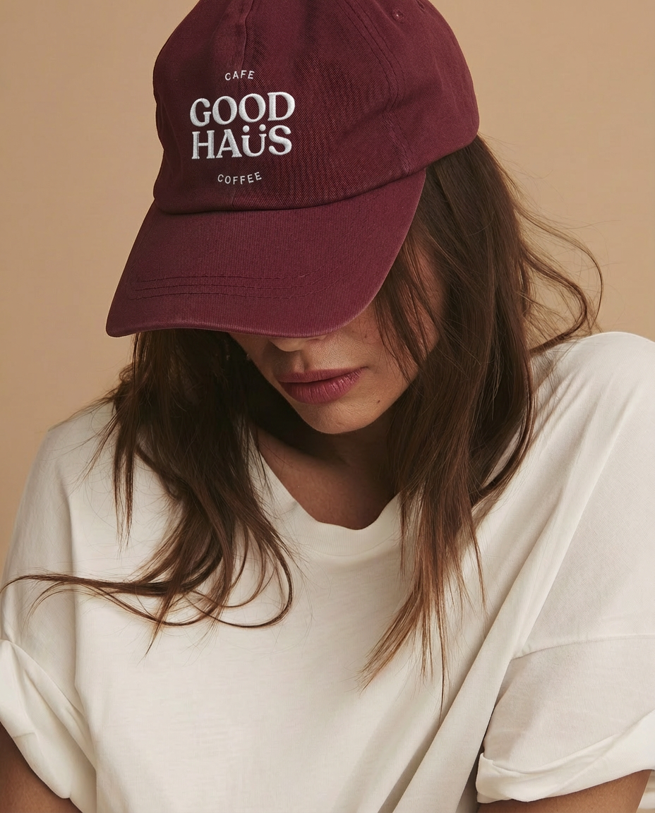

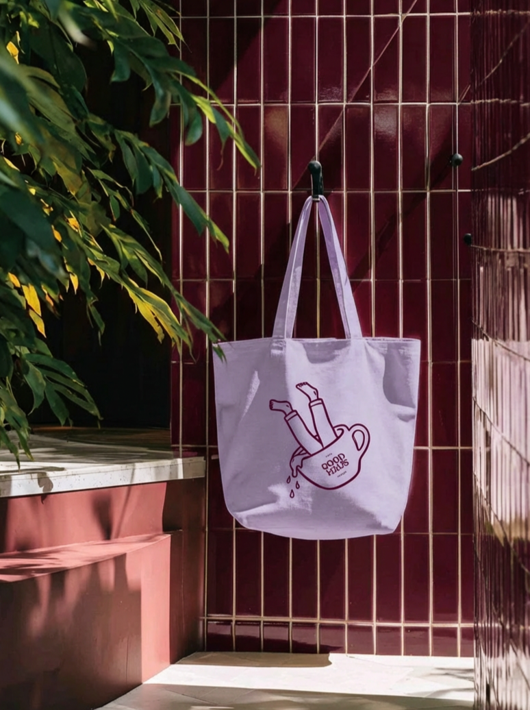
Visual Identity
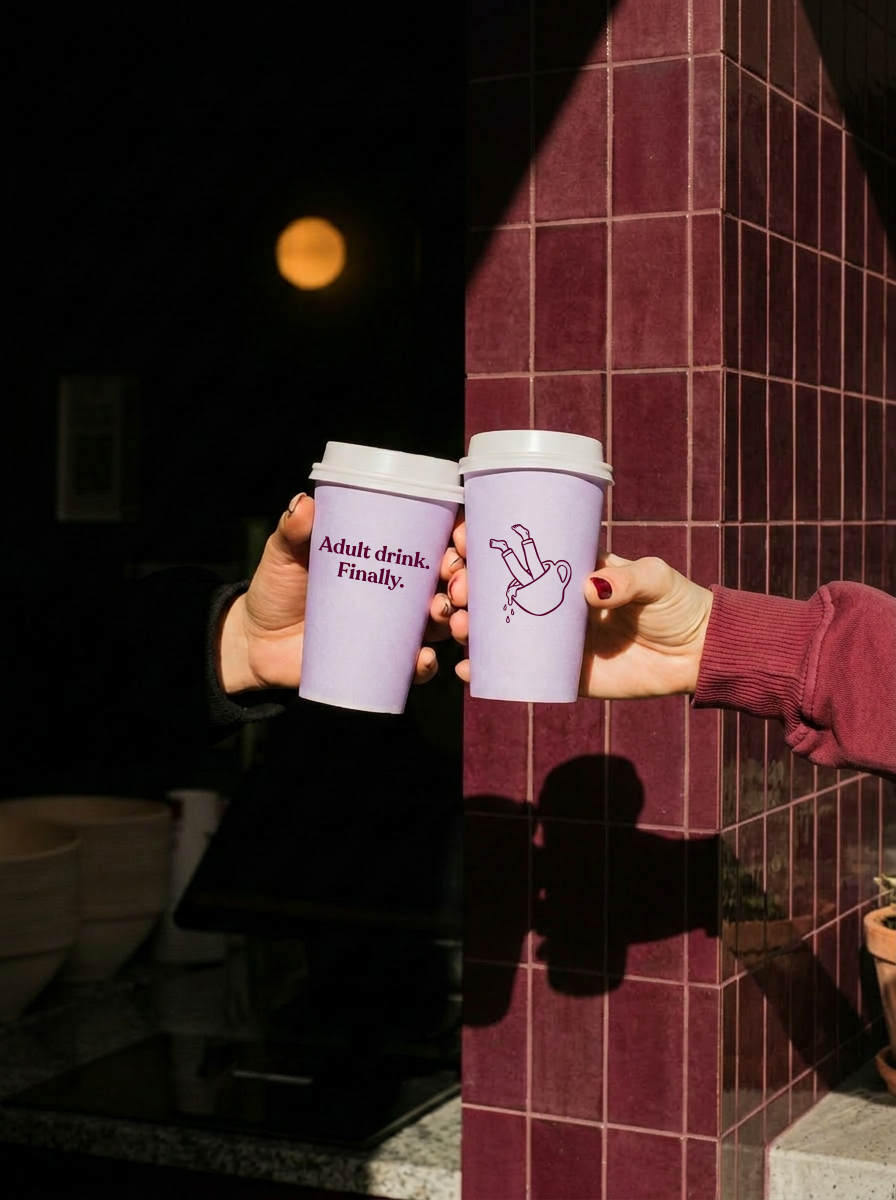
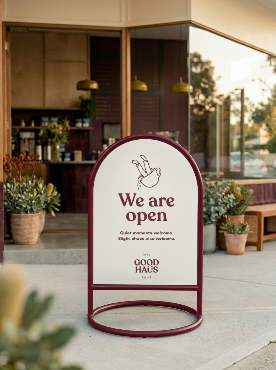
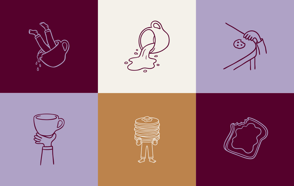
The visual identity for Good Haus reflects a calm, adult-first environment while subtly acknowledging the presence of children.
Rather than adopting typical café or family-focused aesthetics, the system leans toward a more editorial and design-led approach — using restraint, balance, and clarity to create a space that feels considered without becoming cold.
Small moments of imperfection and play are introduced through hand-drawn elements and understated details, adding warmth and a sense of everyday life without overwhelming the experience.
-
The identity uses restraint and space to create ease, avoiding both visual noise and sterile minimalism.
-
Typography, layout, and composition feel editorial and considered, reinforcing a grown-up environment.
-
Hand-drawn details and small imperfections introduce warmth, allowing children to feel present without dominating the visual language.
Every element was designed to reduce noise, not add to it.

-
Weavy:
Referencing image 1, change the table top to be concrete and side of table to be maroon tiles. remove person, remove hand and arm. Takeaway coffee cup tipped on its side on the table, Lavender coloured cup with no branding, coffee spilling out in an organic way. No lid on cup. Lid colour is white. Lid sitting next to cup on table top.
Put good Haus logo Image 2 on coffee cup
Add in a small toy moster truck near the coffee cup, towards the back of the coffee cup on the right, slightly out of focus.
Good Haus doesn’t try to be everything to everyone.
It chooses a specific role — and delivers it clearly.
A place where parents can pause, reconnect, and leave feeling more like themselves than when they arrived.

Reflections
Good Haus demonstrates how a clear, focused idea can create distinction within a familiar category.
By moving away from generic “community café” positioning and defining a more specific role, the brand establishes a space that feels both relevant and ownable.
The project also explored how AI can support early-stage creative thinking — accelerating exploration without compromising clarity or intent.
Ultimately, the strength of the outcome comes from restraint: a brand that doesn’t try to do everything, but does one thing well — creating space for parents to feel like themselves again.
Outcomes & Learnings:
Using AI in Good Haus
View the behind-the-scenes process with image creation here.
AI was most powerful at the start of the process — accelerating research, surfacing patterns, and helping structure thinking.
Perplexity excelled at gathering market insight
ChatGPT was strongest at organising and translating that into clear strategy
Together, they compressed weeks of work into days, while still revealing key insights like the category’s lack of differentiation
AI also worked well as a creative collaborator, but only with direction.
It naturally leans agreeable, often reinforcing safe or generic ideas.
The real shift came from pushing back — using it as a tool to challenge and refine thinking, not validate it.
The better the direction, the better the output.
Where AI fell short was in execution and taste.
Logo generation lacked restraint and originality
Image generation was promising but inconsistent
Both required strong art direction — less prompting, more like guiding a junior designer. This is where experience became critical.
Key Takeaways
AI is a multiplier, not a replacement
It excels at speed, structure, and exploration
It struggles with taste, nuance, and final craft
Strong outcomes depend on clear human direction
In Short
AI didn’t replace the creative process — it sharpened it. The work only became distinctive when human judgement led the way.